Intro
In the project “Naturally” we experiment with design inspired by nature.
We learn different techniques, both analogue and digital, to translate the shapes and structures of nature into graphic elements.
I also learn how to organize my files efficiently and manage using a good folder structure and database.
The first task was to create a inspiration board with nature photos.
After a lot of puzzling I came to this result (left).
My theme is based on plants and visual effects that arise in the sea.
Based on this inspiration board, I will work with analogue and digital experiments. By experimenting with image research, typography and composition, I eventually create a series of images with its own atmosphere and style.
Before I came to this inspiration board, I misunderstood the assignment.
So I made a mood/styleboard in the beginning, which you can [here] view
During this project I learn important aspects of graphic design, such as image analysis and developing my own style.
I also learn the basic principles of typography and how I can create a series of images that together form a coherent whole.
Finally, I will learn which file formats are suitable for different applications and how I can present my work and give and receive feedback.

Analogue Experiments
This teaching assignment consisted of two parts:
Taking 50 photos and collecting 25 natural objects.
Quantity was above quality in this task.
I found this a bit difficult, because I want to deliver good quality in everything I do.
But it was a good exercise to work on this.
I notice that after this assignment I have become a lot smoother with quantity and quality.
Due to lack of time due to agreements outside of school, this was a challenge.
In the end, I was able to complete both parts.
In the lesson we first experimented analogously with the objects brought along.
We applied it on paper, which did not involve beautiful, neat or original.
Just for experimenting itself.
As you can see (left), I have three A4s full of experimentation.
I did this using watercolor and colored ink.
On the first sheet I tried to make several experiments into one whole, which ultimately also succeeded in performing as well as possible.
Some of the experiments were clearly better than others.
An experience I had with the other magazines.
On the second page I wanted to make a canvas with “splatters”.
I wanted to make patterns with the leaves, shells, and so on.
Unfortunately, this did not go as planned, although the result is still interesting.
In the third experiment I worked with multiple colors in one experiment.
This was in a more chaotic, punk-like style with inspiration from the Netflix series “Arcane”.
Given the process and the end result, this is one of my favorites.
We also worked on a good folder structure.
I had a fairly organized and clear folder structure before.
I must admit that this assignment has made my database even improved considerably.
Eventually I moved and uploaded my G-Drive school database to my SSD.
Unfortunately, this caused some delay for the next task.
This was important in the event that there is no internet available.

Digital Experiments
The 50+ photos I took earlier were required for this assignment.
In Adobe Photoshop, I was needed to make 50 different edits of the photos taken.
Below you will find a reduced collage of these photos.
Below it is a button that navigates you to the full collage of 50+ edits.
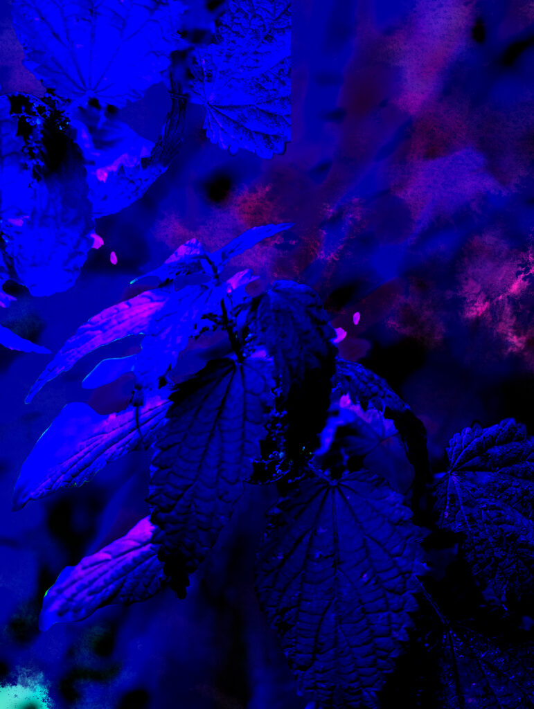
Here (left) is one of my favorites that have not been used elsewhere.
I’ve played a lot with “Blending modes”, “Stylized Filters” & “Adjustment Layers”.
In the beginning it is clear that I was still finding my way in which style I liked the most.
Eventually I came to “Divide”, “Difference” & “Hard mix” layers.
This in combination with blur effects & the previously mentioned “Stylized wind” effects.
I also eventually merged multiple edited & exported photos.
As mentioned earlier, I have been delayed due to my old folder structure.
Some edits are very simple and low-effort compared to the rest.
Although in this assignment it was also a focus on quantity instead of quality.
Both practice in the previous assignment and the time pressure helped to complete this assignment.


Want to check out the full collage?
Visual Analysis
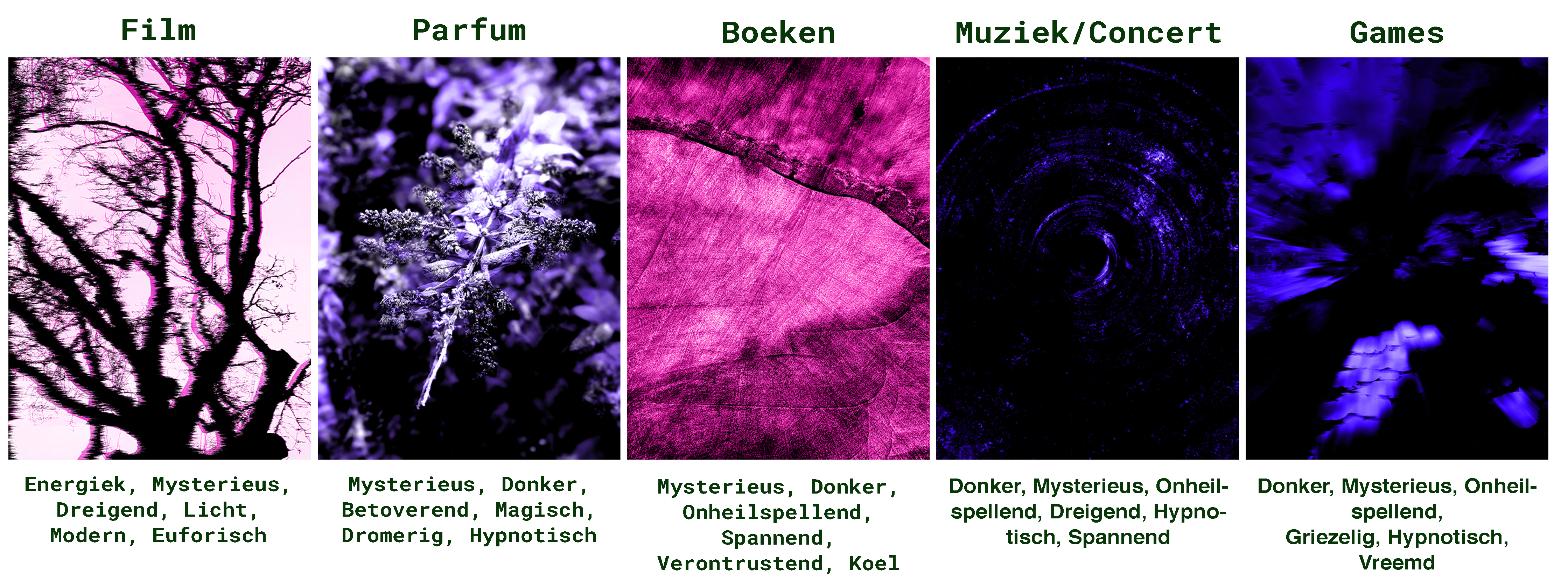
For this assignment I had to choose 5 edits and find out how it could be best used.
I also had to think about what kind of atmosphere these edits gave.
As desired, I have merged the 5 photos in a Photoshop document and added the text to it.
At the top I noted what an edit could be used as a poster.
At the bottom I have noted the atmosphere of each image.
Image text translations:
Image order is from left to right.
1: Movie | Energetic, Mysterious, Threatening, Light, Modern, Euphoric
2: Perfume | Mysterious, Dark, Bewitching?, Magical, Dreamy, Hypnotic
3: books | Mysterious, Dark, Ominous, Exciting, Calming, Cold
4: Music/Concert | Dark, Mysterious, Ominous, Threatning, Hypnotic, Exciting
5: Games | Dark, Mysterious, Ominous, Scary, Hypnotic, Strange

Typography: Helvetica
Since the beginning I have been working towards a poster, also in this assignment.
For this assignment I had to make 10 different posters with the same requirements;
– Use A3 formatting
– Use the Helvetica font
– Only use white, black and red coloring
– Use the same text for each designs
Fortunately, this worked out well, although it was quite the task to make something original every time.
Below is a picture with all 10 designs.


Font Design
This assignment wasn’t one of my favorites, but participation was mandatory.
We had to develop this project with pen and paper.
The challenge was to design a variety of fonts.
Each of them inspired by different emotions, tastes, or situations.
I’m much more comfortable in the digital realm.
So this hands-on approach definitely pushed me outside my comfort zone.
I was given a list of words and tasked with creating fonts for each of them.
Some words sparked more inspiration than others, resulting in multiple design explorations.
The assignment had to be completed within a 30-minute timeframe.
I initially hesitated because of my preference for digital design.
However I managed to produce at least one design for every word on the list.
I can’t say I’m completely satisfied with the results though.
I do recognize the value of honing my skills in physical design.

Font Pairing
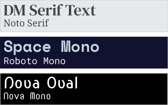
In this assignment about typography we had to pair fonts together.
With the help of Google Fonts I got a few examples ready fairly quickly.
I added the Font Pairs together in Adobe Illustrator.
Of course this did have requirements:
– Visual comfort
– Correct contrast
– Readable text
As you see I was able to comply to these requirements.

Posters, prologue
This is the project that I was preparing for with the other projects.
We learned the essentials of creating a poster bit-by-bit until now.
Now it was time to design the posters, of course this had requirements:
– Make a series of posters
– Take note of readability
– Include the title, date, time & location
– Pick one of the assets used in “Visual Analysis”
– Work in CMYK on a A3 printing format
Poster 0
I expected this process to go rapidly and smoothly, but it didn’t go as planned.
It’s okay to be sure of yourself, but I over-estimated myself a little too much here.
I initially wanted to make a concert poster collection for a musician I’m into.
I messed up the CMYK color settings because of this the colors didn’t match my vision.
This poster is shown on the left.
Posters – Retry
I moved towards a different direction and went for a more modern and sleek design.
I wanted to design a VFX (Visual Effects) Exposition poster.
After playing with the composition and angle I created a subtle yet elegant design.
For this poster I used the Quantico font, bold for titles and regular for other text.
Since this was supposed to be a series I kept that font and text sizing in all posters.

Posters
In this section I will be explaining my thought process about the posters listed bellow.
This was a steady process with a lot of unsuspecting turns.
Some information about older or archived versions are documented [here].
Poster 1
I went for a centered and sleek design for the first poster.
I combined the main design into two mirrored versions.
After that I overlapped another copy of the design in 0% saturation and opacity above it.
Poster 2
For poster 2 I went with a more colorful approach.
In the second image bellow there is a progression sheet of how I progressed towards the remake of poster three.
I started out with the original and centered the text and tested a darker background.
Eventually I chose to enlarge the dates drastically and flipped the “2025” vertically.
I chose to apply a color burn layer in purple to improve readability.
I darkened the background and added some divided blending layers in squares for extra accents.
This was not my initial plan for poster 2, find out more [here].
Poster 3
For the third poster I wanted a more bright and chaotic outlook.
I copied the main design a total of four times.
I reduced the saturation to an absolute 0 and added a “levels” adjustment layer, here I tweaked how much black & white was shown.
For the text I added a white rectangle with turned down opacity for readability and positioned both blocks in the left & right corners.
This also wasn’t my original idea for poster 3, find out more [here].

Feeling like exploring more of my projects?