About Hierarchy
Hierarchy is a project developed for a elective subject for my study.
This project aims to enhance my typography and hierarchy performance.
Enhancing these skills should result with an improved professional results designing projects.
In order to grasp a more specific scope I will be focusing on designing posters and multimedia designs.
An additional reflection including documentation for EXPO Posters is scheduled to be documented at a later date.
Table of contents
– EXPO Posters –
– Image bank –
– Personal Object –
– Commandments –
– Roadmap –
– Experiments –
– Reflection I –
EXPO Posters
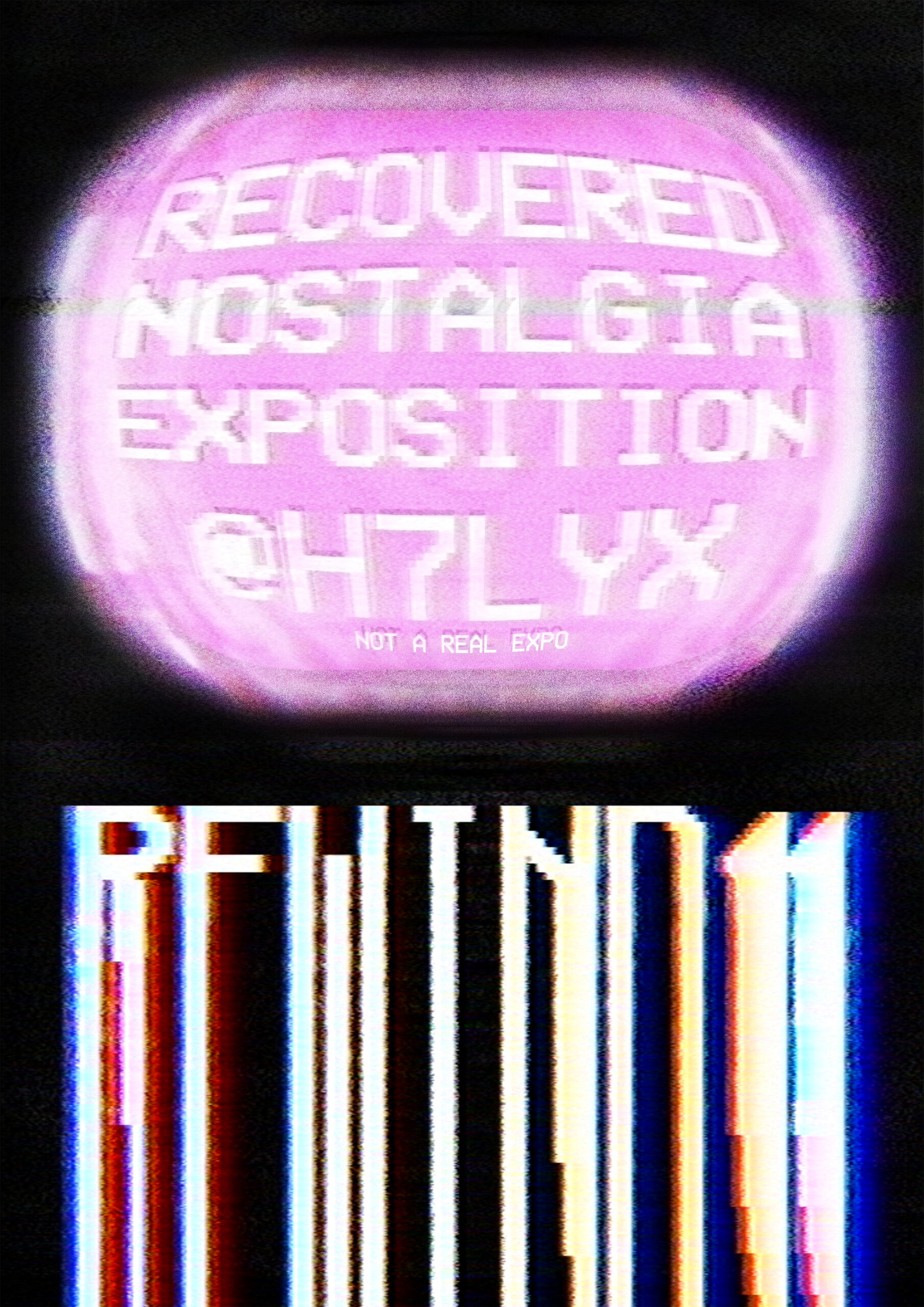
Image bank
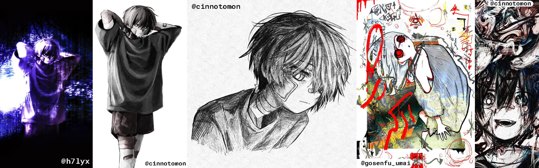
The elective subject started off with creating a image bank.
This was intended as a similar idea of a mood-board.
Rather than being an actual mood-board it is designed to fetch inspiration.
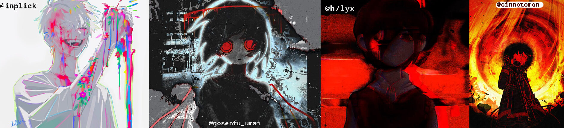
I made four rows, row one containing two sections.
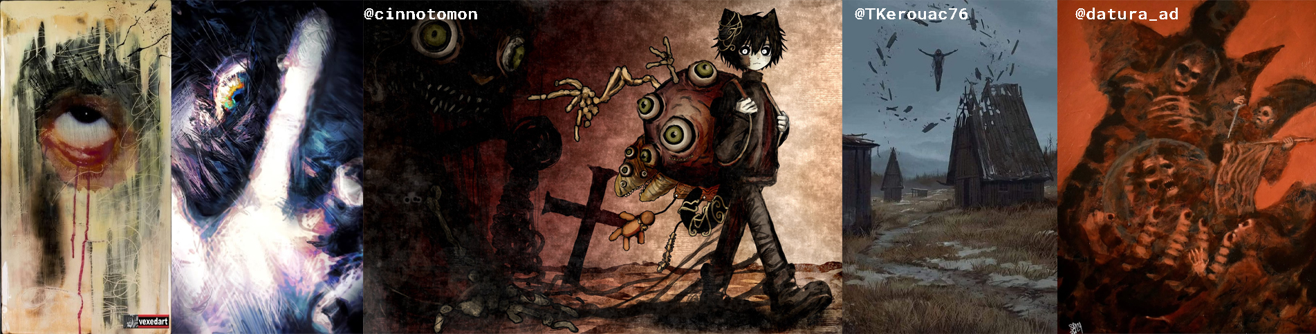
Row one contains my favourite artworks at the time in terms of their style.
Some of these projects are also made by myself, ladled “@h7lyx”.
I like alternative, dark and or horor settings, this reflects in the first row.
The second row contains assets I’m interested in since it shows how the artists drew their drawing.
This row also contains some glitch art which is a genre I enjoy a lot and work with myself.
It also features a photo from the movie Interstellar, one of my favourite movies.
The third row contains artwork that I really appreciate.
I wouldn’t work in a similar style, but they inspire me.
The artists are extremely talented and show a more alternative style which I like.
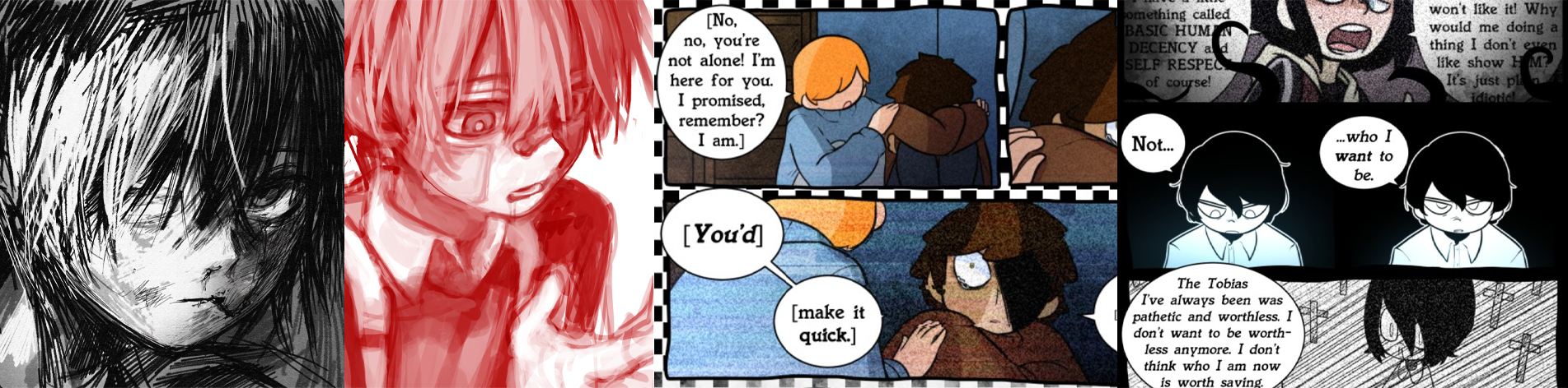
The last row features artwork and panels from a webcomic.
I included these since I appreciate these more than rather giving me inspiration.
I like these projects especially because they all have a deeper meaning behind it.
The webcomic panels (Ghost Eyes) are more direct, the artwork less.
Regardless they show struggles with mental health, specifically in men.
I recognize that men’s mental health is not treated as it should by society,
which is upsetting to see and I wish for this to change.
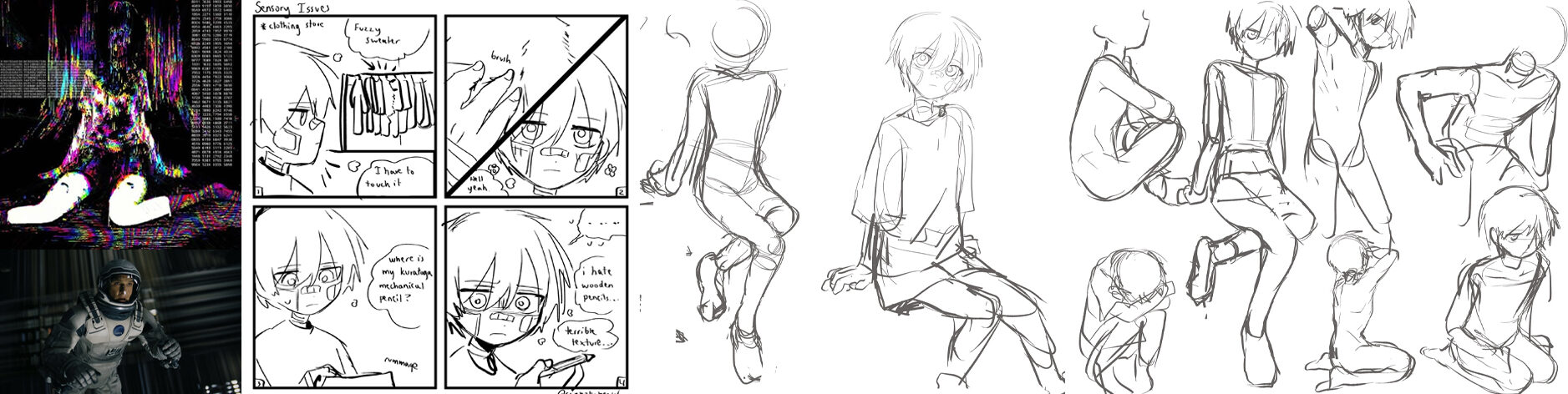
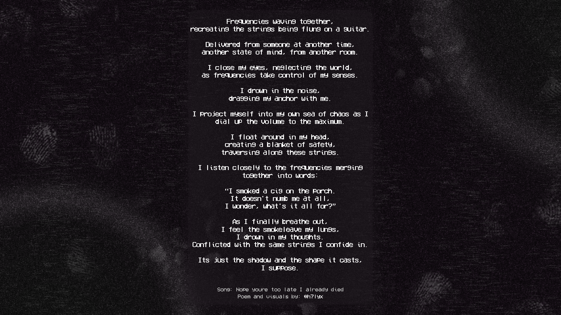
Personal object
In this section I was supposed to bring something that I held dear to me.
I chose to use my headphones (Sony XM5) for this assignment since I use them very frequently.
The assignment was fairly simple, I was supposed to write formal and informal facts about my headphones.
Formal: Their headphones, black in color, compact, about the size of a plate.
The shape consists of two ovals connected to a bent cylinder with a matte texture.
Due to its texture it attracts fingerprints easily, they weigh about 250 grams.
Informal: I don’t hold specific memories to my headphones since they produce sensory.
I have them since september 2024, and I wear them about 8 hours a day.
I walk and travel with music or play video games with friends.
I feel safe and calm wearing them with its noise canceling since it suppresses a lot of noise.
This makes chaotic situations a lot more comfortable.
From here on out I was supposed to merge these formal & informal details without directly describing the object.
I chose to write a poem and create visuals based on keywords (marked in italic).
I did this because I enjoy philosophy alot and I enjoy expressing myself writing.
The song referenced in the poëm is: “Nope your too late I already died“
Published by wifiskeleton & I wanna be jack-o-lantern.
Commandments
Now that I have experimented and oriented the next step is the actual project.
In order to keep track of my goals I set up 1 goal and 9 commandments.
I want to improve my designs and become more professional in developing them.
Having established this goal I needed to think of 9 commandments I would keep myself to.
I gave myself a taste of what’s to come, and made a small poster with these commandments.

Roadmap
In order to have a clear idea of how I will handle this project I wanted to make a roadmap.
I used Groow, a software I use for project documentation at my college for this.
I started out exploring other designers, and redesigning this website for its documentation.
After I feel like the knowledge I got from exploring other designers I will start with the experiments.
Once this works out I am going to reflect and ask for feedback on these experiments.
With that last layer of feedback and some more research I will develop 3 final posters.
The end of this project is the exhibition where I will showcase the final posters.
Experiments
In this segment I will design 15 experiments, with three categories.
This process was quite hectic and fast paced.
I have been very short on time due to personal events.
After all the newest designs in all categories turned out something I’m quite happy with.
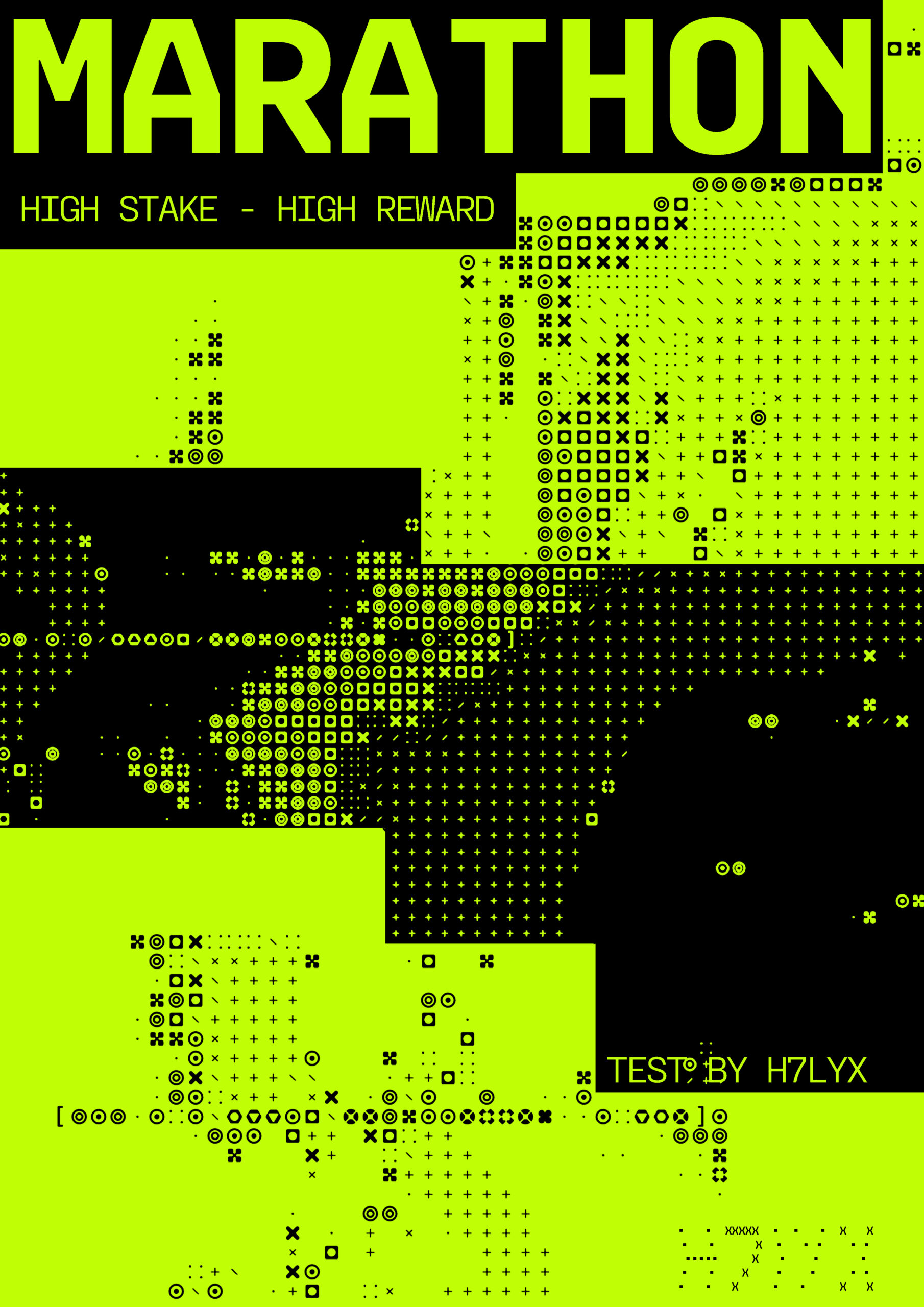
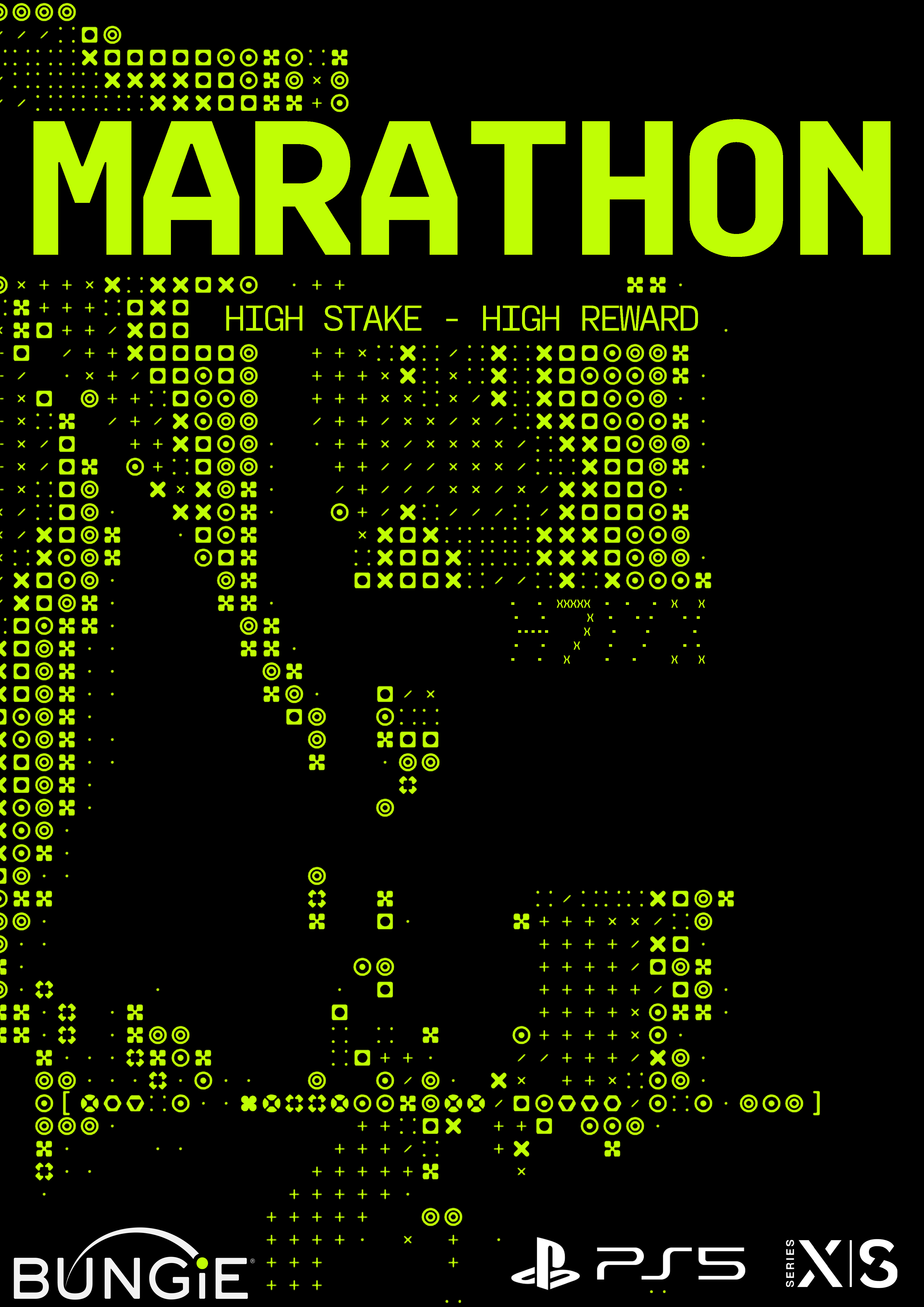
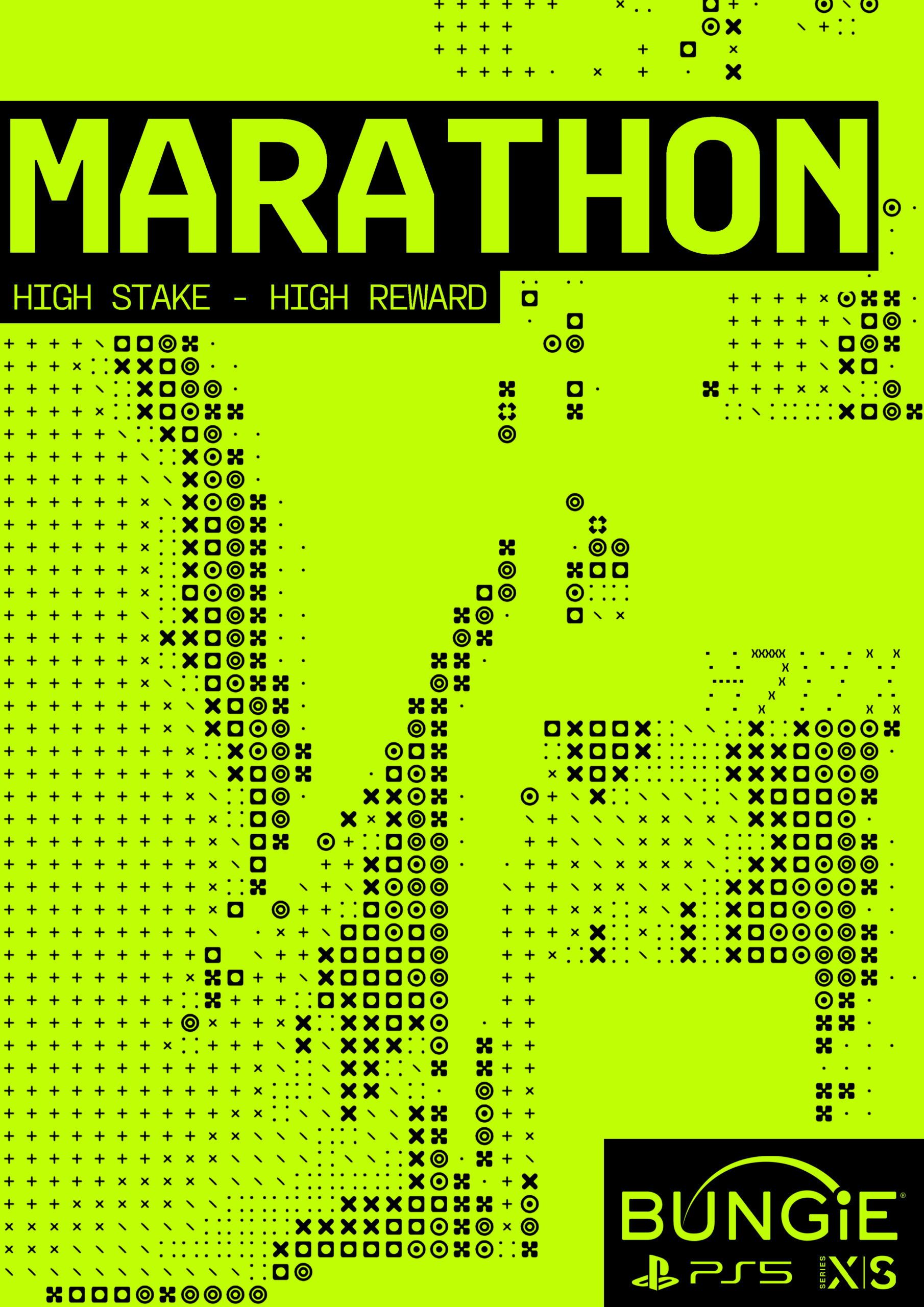
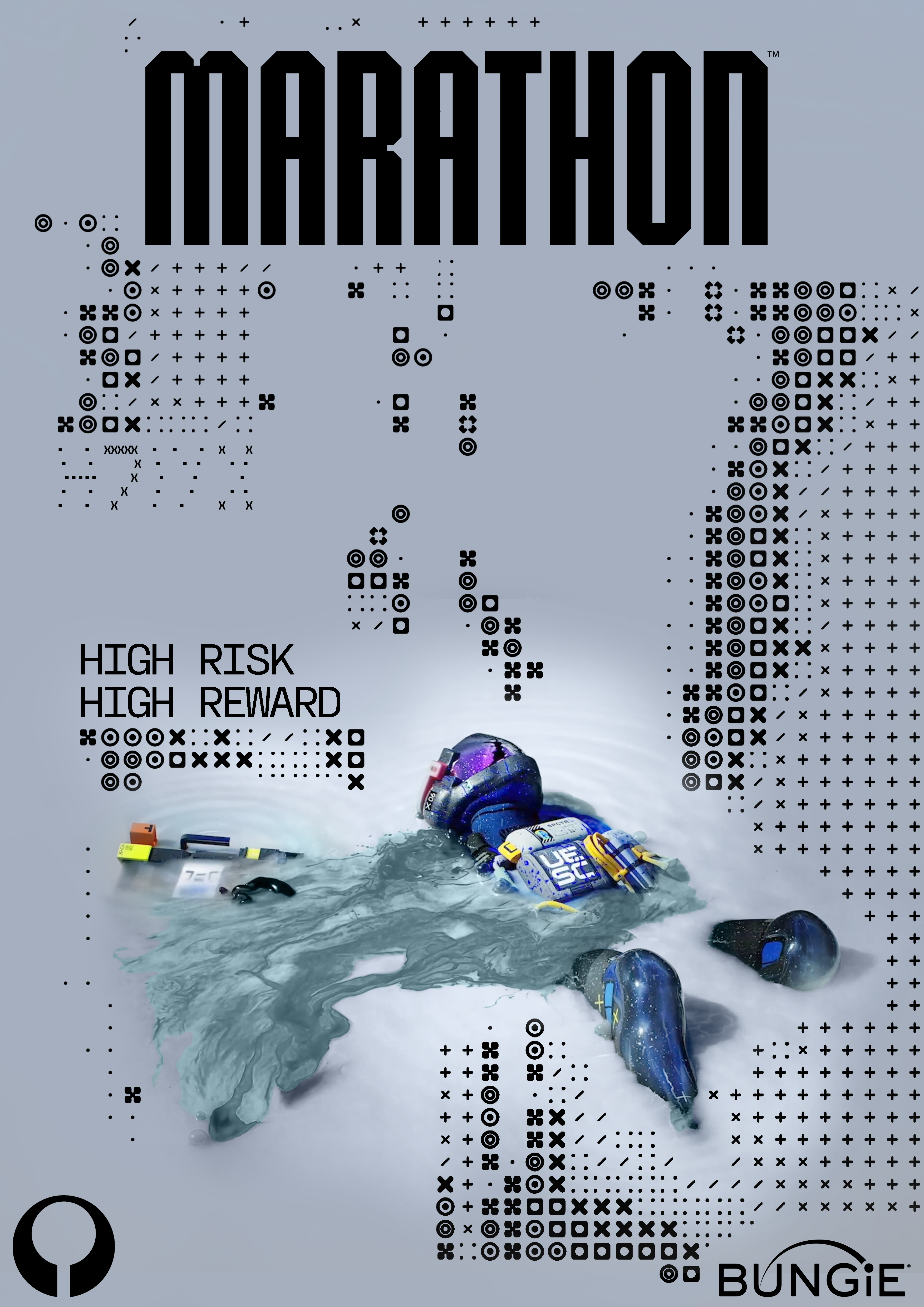
Category one is centered around promotional posters for the game Marathon.
Marathon is a reboot of its original game released in 1994.
Bungie, the creators behind games like Call Of Duty have reimagined the franchise.
Using assets made available by Bungie and the Marathon team I made 5 experiments.
It’s clear I was orienting myself a lot.
I struggled a lot in the beginning, which is noticeable.
I did manage to get some visually pleasing results in version 4 & 5.
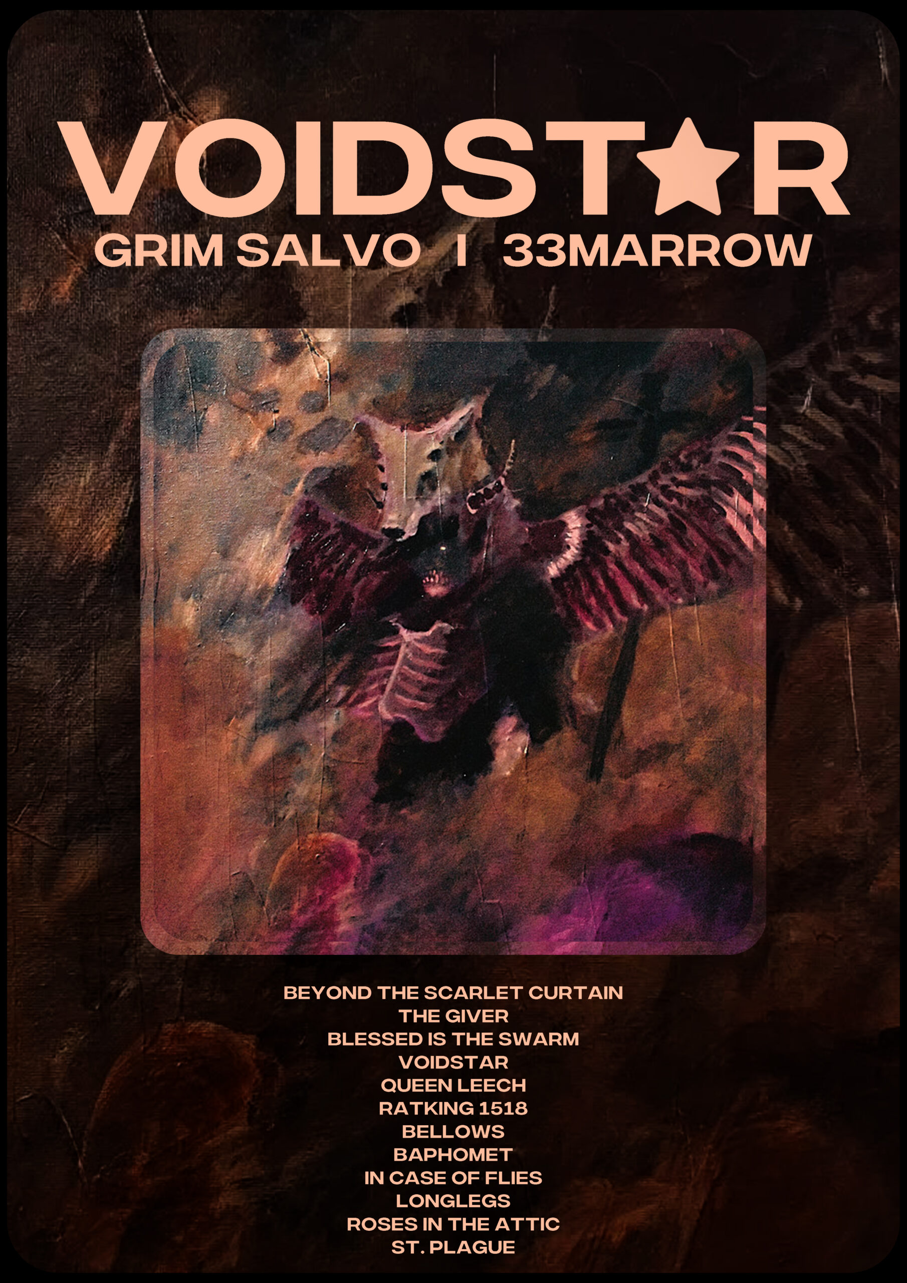
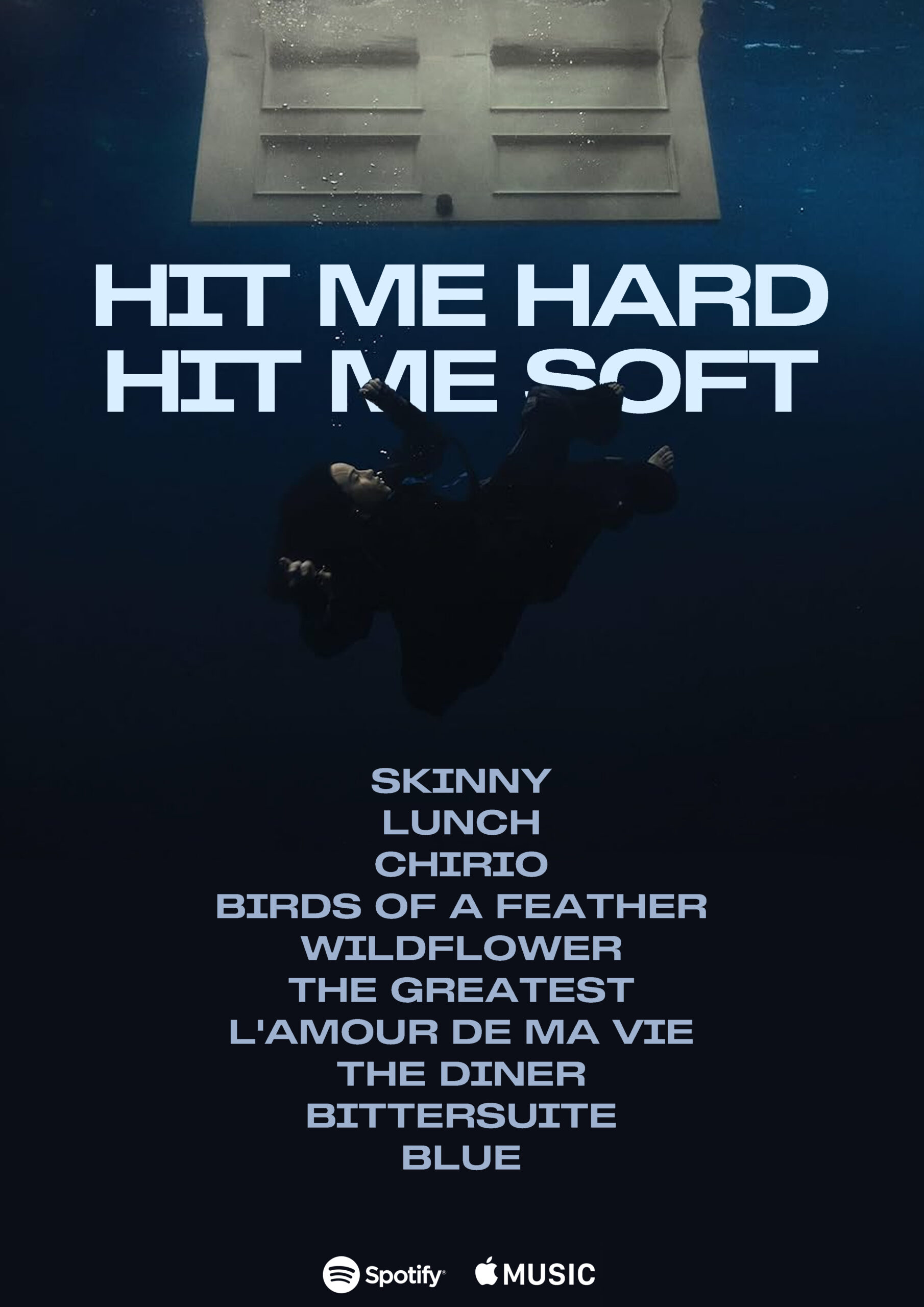
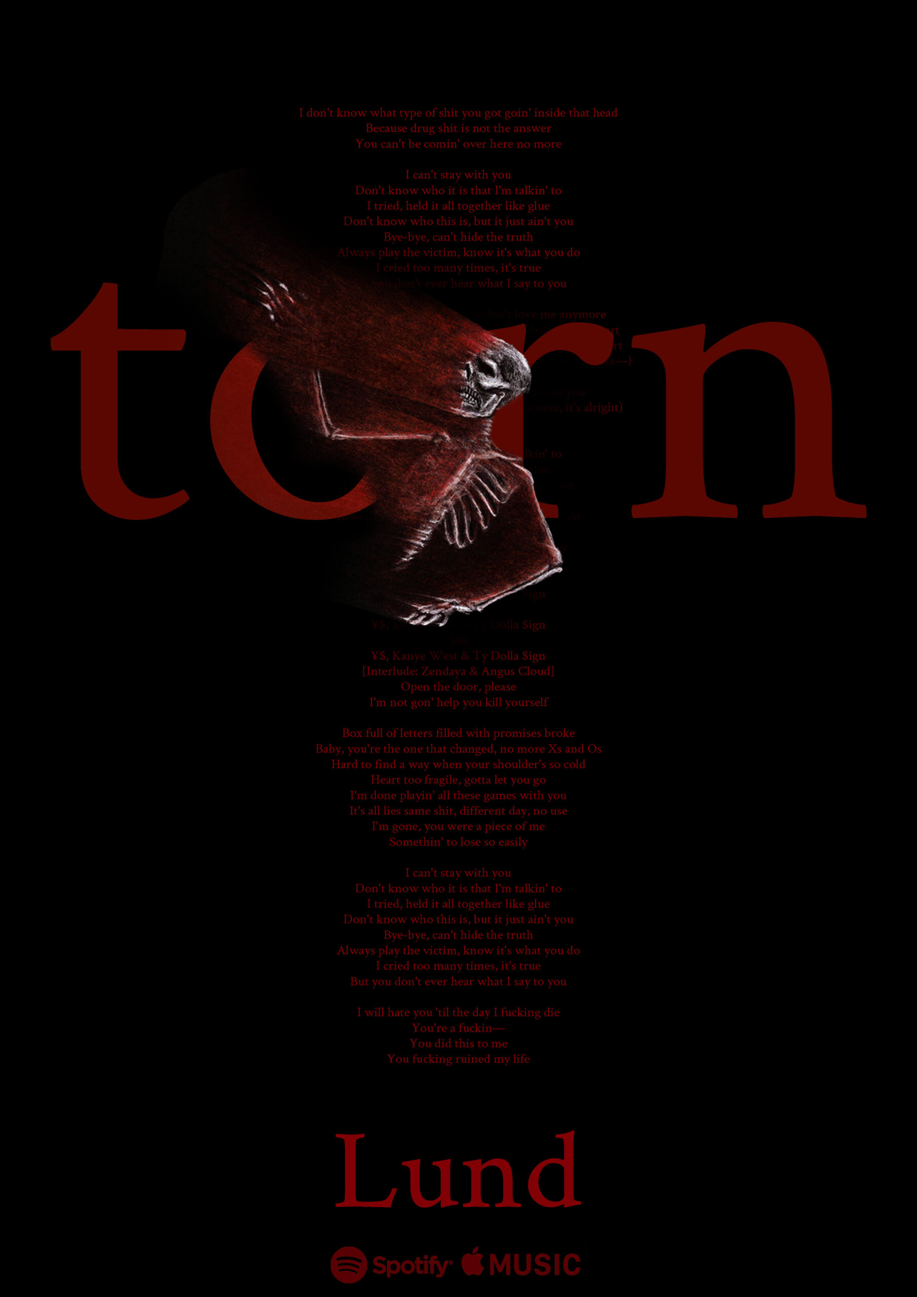
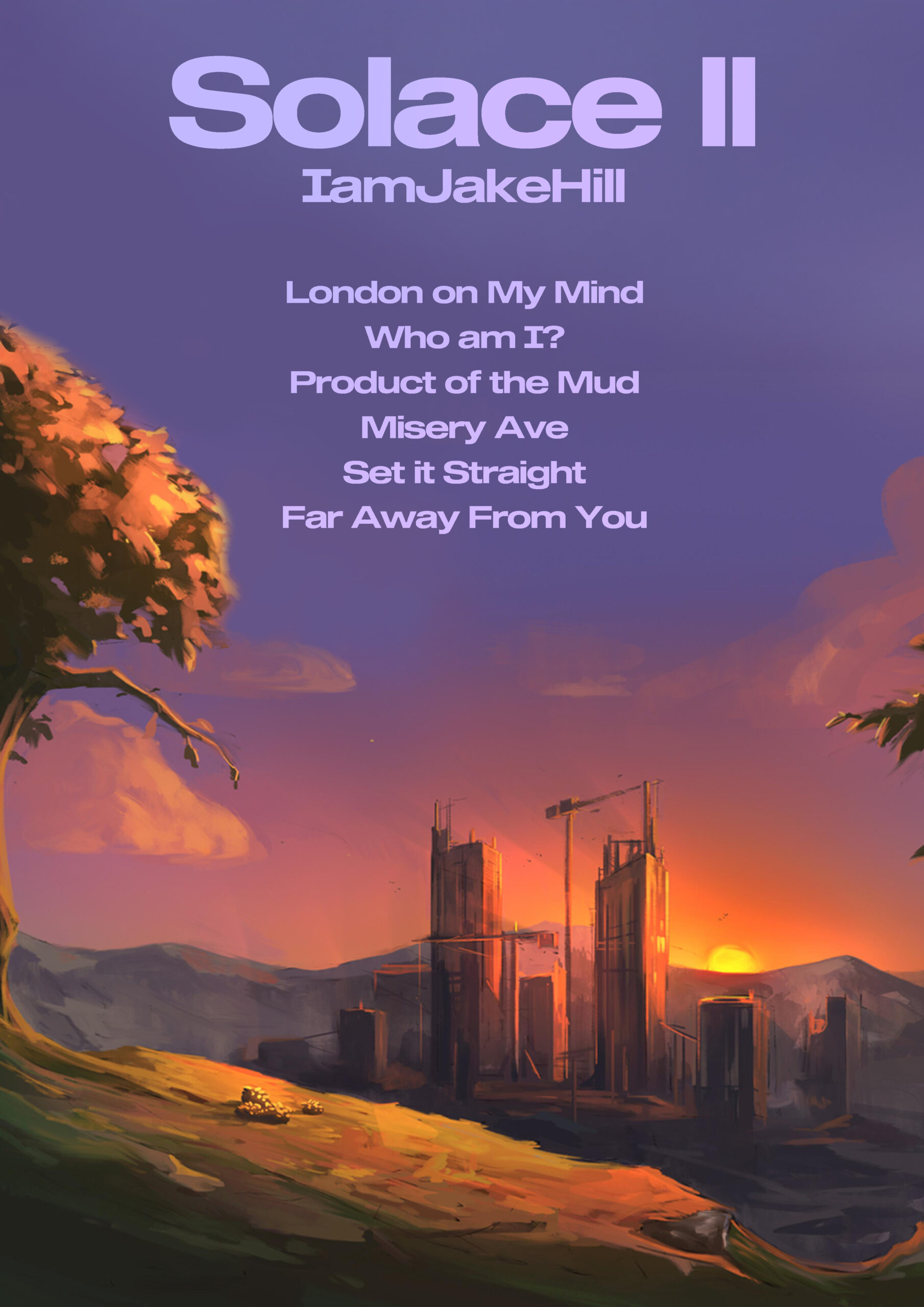
Category two was focused on promotional album posters.
Again there is a drastic difference in quality version after version.
I am really happy with version 3, 4 & 5, I was finally getting into my workflow.
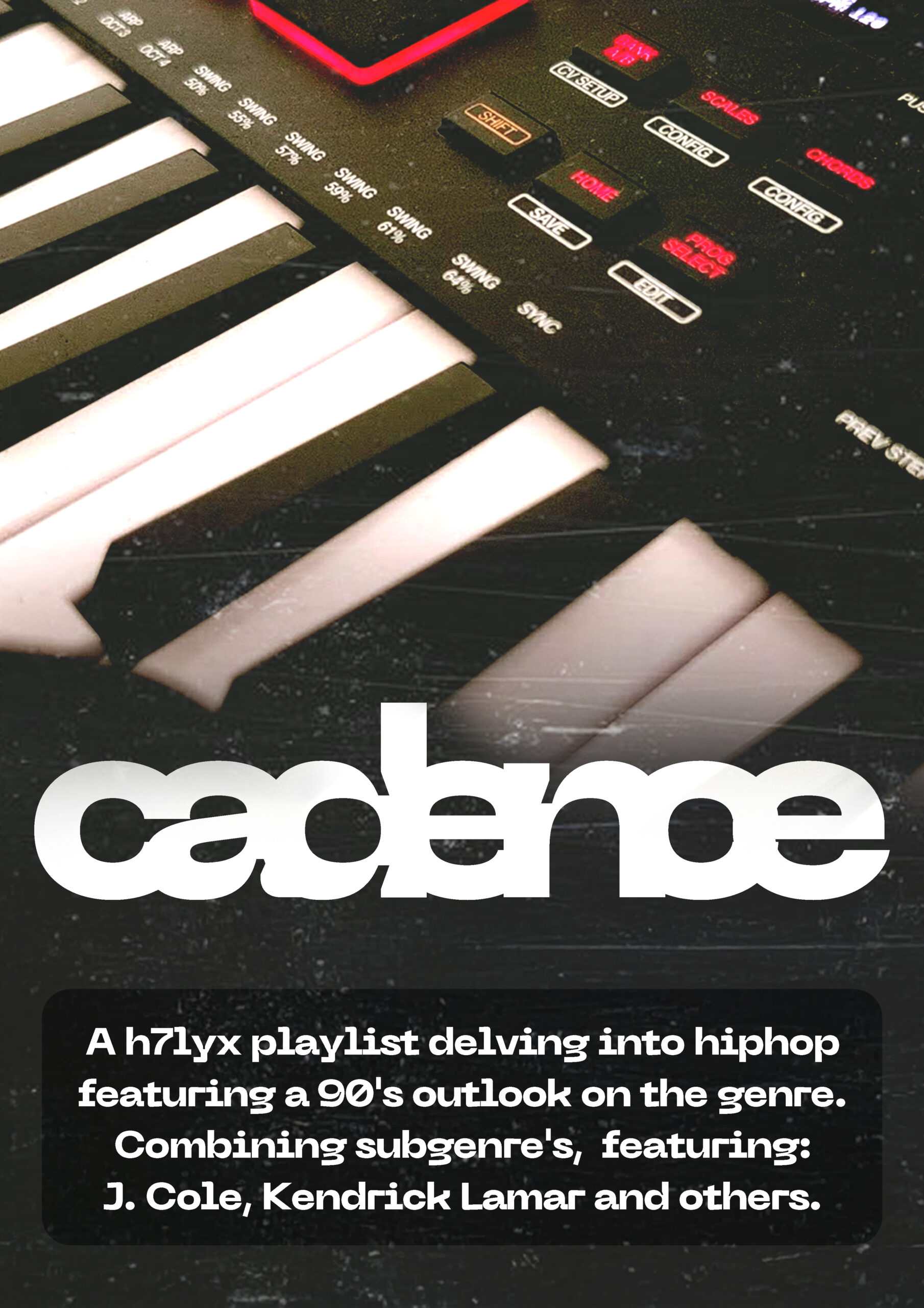
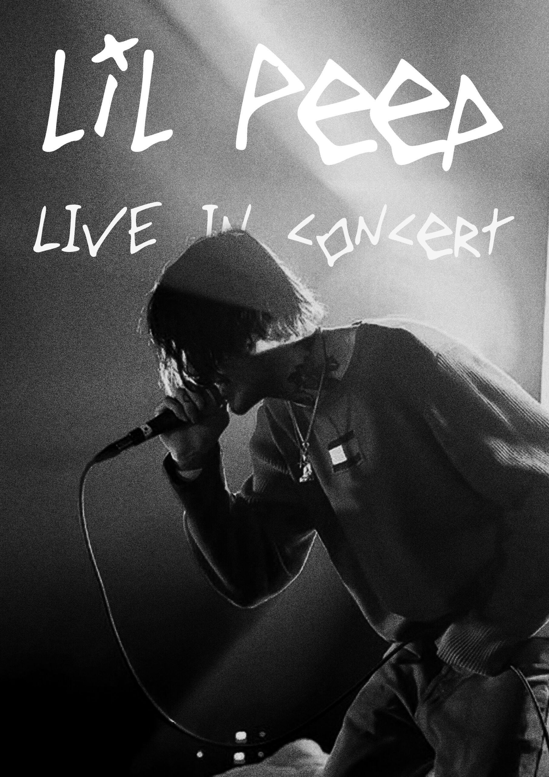
Category three was meant as a let-go.
It is centered around multimedia to give me a full range of control.
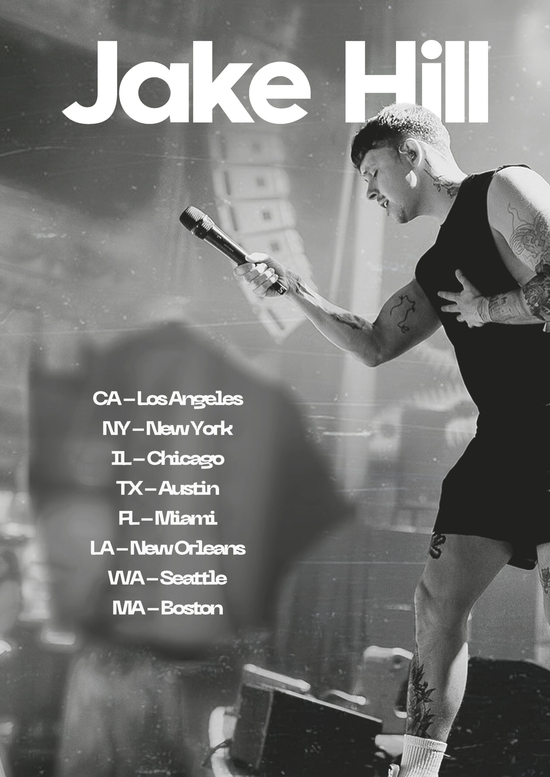
I started out with some concert posters of artists I enjoy (lil Peep & JakeHill)
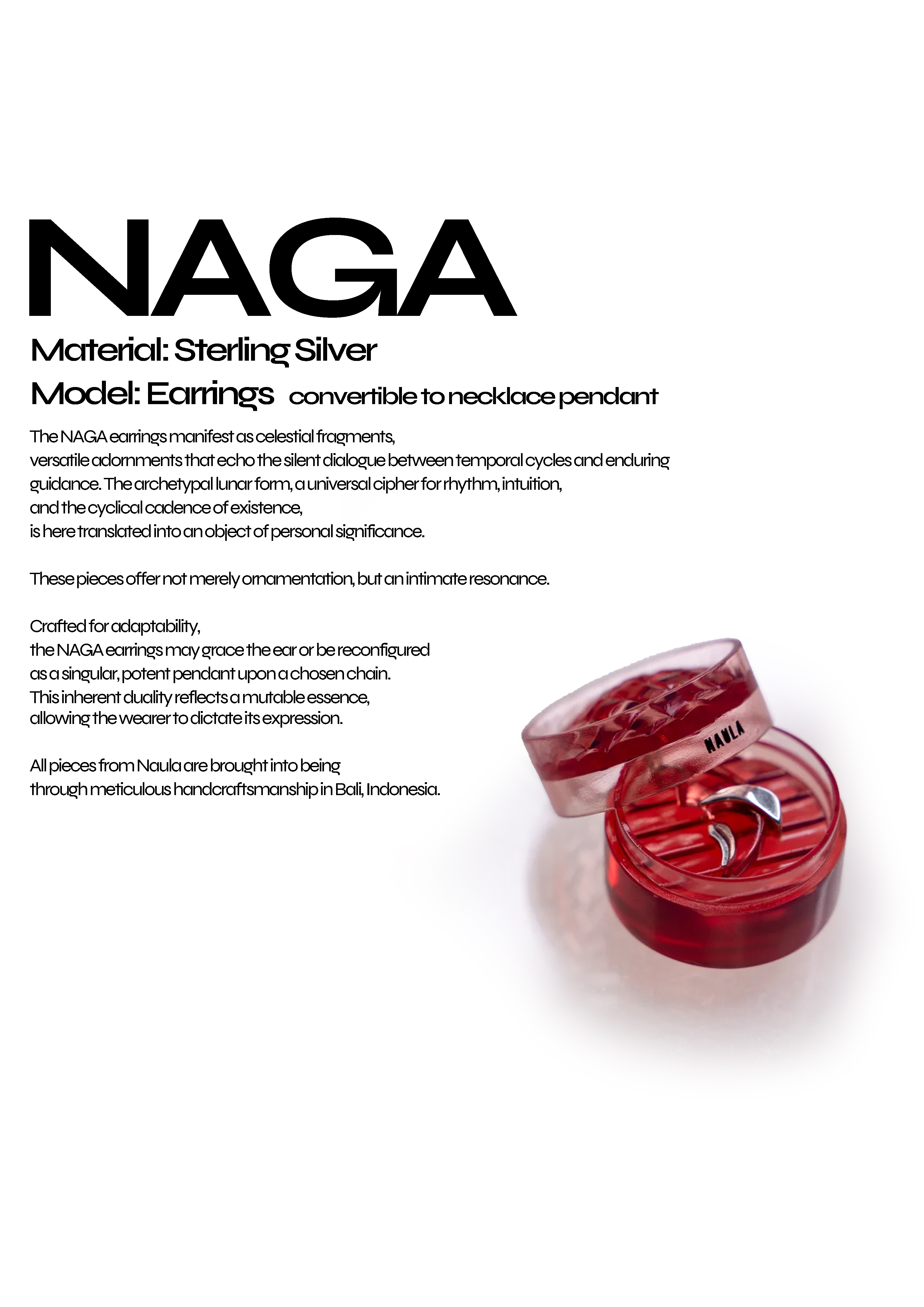
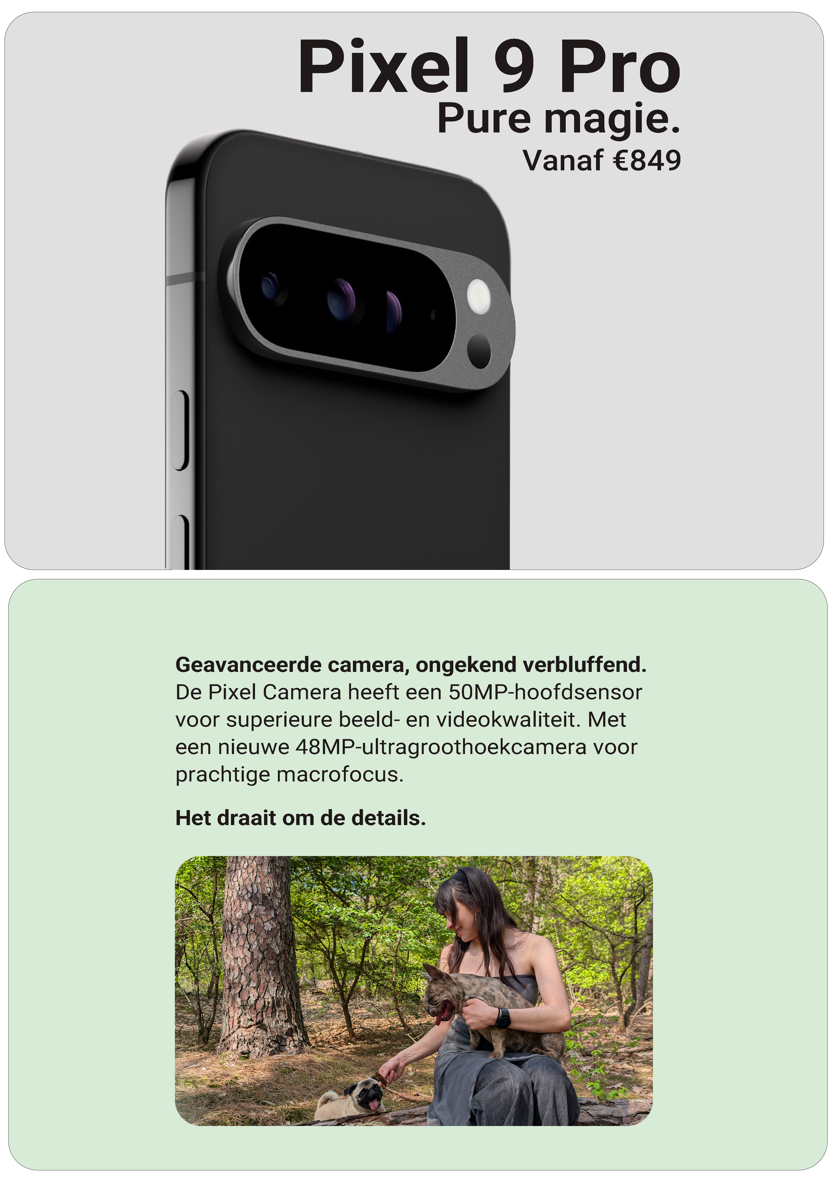
After this I oriented around product marketing, which was very new to me.
Looking back at it I feel like it’s visible I was struggling with these.
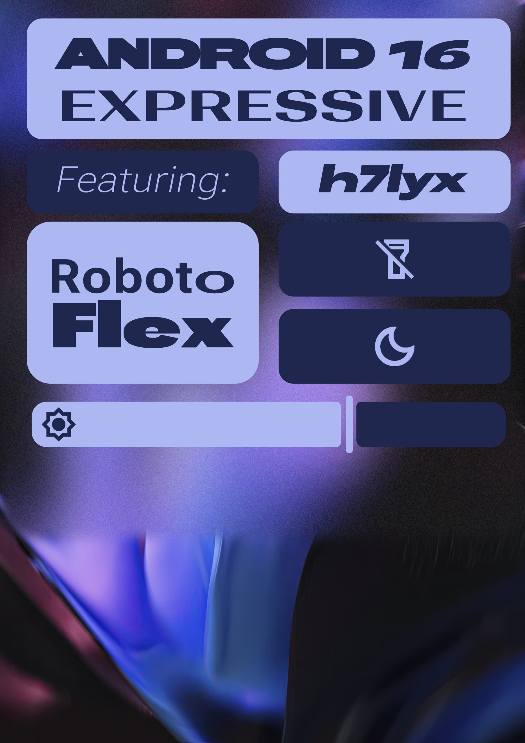
In the fifth version I delved into Google’s new android version (16).
Version five took a long time but I am happy with what it turned out to be.
I like this category most of all, it gave me the most room to grow.
It went from concert posters, all the way to UI design which right now, is still quite experimental.
Since I was lacking theory and skills for this project I had to educate myself.
I watched quite a few videos on design and read through Google’s design language for Android 16.
All sources and documentation for these can be found through [this] link.

Reflection, part 1
Now that I have finalized experimenting it’s time for some reflection.
Not just because “I have to” but because it helps me to improve upon the final media.
My reflection is portrayed in video format with a little bit of a documentary format.
And in case you’re one of my teachers reading this, I added Dutch subtitles for your comfort.